Wednesday, 20 March 2013

Jake Lever


The blue, the dim and the gold


I first saw this piece at Medicine Unboxed 2012. It is a beautiful representation of the journey that Jake made with his dad who had a terminal illness.
 
"I approach my practice as a contemplative activity. My images are often derived from fragments of medieval paintings, frescoes and icons. Recently the hand has provided a focus for my work, a framework for the exploration of frailty, vulnerability and the presence of the divine"


JAKE LEVER believes that the arts can be an aid to recovery and the ongoing wellbeing of a person. He will be debuting his huge and stunning piece, the Blue and the Dim and the Gold. As tiny, fragile vessels, adrift in a half-light world, Jake helps us navigate the ‘dark night of the soul’, buoyed by the belief that there is a shimmering beauty to be discovered in the darkness

Monday, 18 March 2013

Damien Hirst: The Last Supper


Hirst has replaced the name of the drug with the name of a food traditional to working class British café culture, for example 'corned beef' and 'sausages', transforming the food into a brand by the addition of the insignia ®, TM or decorative typescript.
Such variations on the artist's name as Hirst, HirstDamien, Damien, Damien & Hirst, Hirst Products Limited, also set in a range of typescripts, have taken the place of the usual drug manufacturer's logo.

 
Hirst has compared medical packaging to the formats of minimalism, saying:
'a lot of the actual boxes of medicines are all very minimal and could be taken directly from minimalism, in the way that … minimalism implies confidence.'

Damien Hirst, ‘Chicken’ 1999

 
For Hirst medicine, like religion and art, provides a belief system which is both seductive and illusory.
 
He has said:
'I can't understand why some people believe completely in medicine and not in art, without questioning either'
 
The Last Supper refers to the way in which medicinal drugs are becoming a regular part of everyday life, as common as the food Hirst has chosen to represent. Like pharmaceuticals, the side effects of which are not always pleasant or harmless, these common British foods often contain an unappetising and potentially dangerous cocktail of drugs, including whatever chemicals the industrially farmed animals have been fed, and notoriously large amounts of heart disease-inducing saturated fat.

Damien Hirst, ‘Cornish Pasty’ 1999


Medicines, prescribed by doctors to alleviate and cure illness, are commodities manufactured and sold by large corporations. Like the Brillo boxes, Coke bottles and Campbell's Soup packaging imitated by American artist Andy Warhol (1928-87) in the 1960s, Hirst's version of The Last Supper refers to the everyday dependence on reliable panaceas which medical and fast food industries feed off (Warhol also submitted this subject to the manufacturing process of screenprinting).

Damien Hirst, ‘Sausages’ 1999


Hirst has commented,
'I like the idea of an artist as a scientist. A painter as a machine. The packages in The Last Supper and in the medicine cabinets are … trying to sell the product … in a very clinical way. Which starts to become very funny.'

Damien Hirst, ‘Beans & Chips’ 1999

 
All of Hirst's thirteen components in his version of The Last Supper are potential betrayers, providing a humorously cynical comment on self-destructive aspects of British society.

Friday, 15 March 2013

Karen Kamenetzky: Cellular art


Karen Kamenetzky is a textile artist making quilts inspired by microscopic/ cellular imagery.
 
" A kind of visual invented biology with textiles"


"I find this imagery metaphorically rich since all change fundamentally happens on this infinitesimal level."


Wednesday, 13 March 2013

Joanna Walsh Hospice drawings 2011


Joanna Walsh’s ‘Ars Moriendi: the art of dying’ was an artwork created in the foyer space of Wellcome Collection, exploring our relationship with death through personal and quietly affecting drawings.


"It all started when the woman living next door to me, who is in her 90s, became bedridden. She is cared for at home by her widowed son. Her bedroom shares a wall with mine and I can hear her: sometimes she watches the telly, sometimes she talks to herself, sometimes she is in pain. She is having what most people consider to be a 'good' death: in her own home surrounded by her family, something not everyone is lucky enough to experience."


"I investigated art from Wellcome Library, including Ars Moriendi, the medieval instruction manual for a 'good' death in the Christian tradition, but also portrayals of death from other cultures and other eras: vanitas art designed to remind the living owner of the precarious nature of mortality, and grave goods from ancient civilisations made to ensure a smooth transition for the soul from its before- to after-death existence."
 
"I was surprised and impressed by the beauty and delicacy of the objects I found associated with such a dark and difficult subject. I wanted to make something that responded to these qualities."

"I chose to work at Sobell House Hospice because, although it cares for patients who need more medical attention than would be possible in their own homes, it allows patients, their families and friends to create their own environments, altering them as much or as little as they desire and circumstances allow."

 
"At the hospice I became interested in the personal objects patients find important to have with them, and how some seem familiar from the images I found at Wellcome - flowers, pictures, clocks - while others remain entirely personal."
 
"As in the original Ars Moriendi, residents are also encouraged (if they like) to prepare for death by creating something themselves: through music, art, writing or religious contemplation. In a culture where death is taboo and art about dying is scarce or considered morbid, there are few modern visual traditions surrounding 'a good death'.
 
 
"My final work, a large drawing on glass, reflects what I saw at Sobell.I used white on black. Both are traditionally associated with death in many cultures. Wanting to bring dying into the light, I decided to draw in public. And I chose to situate the work opposite the Wellcome Collection's cafe and bookshop so that it could serve the same meditative function as vanitas and Ars Moriendi art."

Monday, 11 March 2013

Stories from the day hospice

http://wellcomecollection.wordpress.com/category/stories-from-the-day-hospice/

Throughout the summer of 2012, Wellcome Trust Senior Editor Chrissie Giles spent time at the day hospice at Princess Alice Hospice, Esher, running a creative writing group. In a series of posts for the Wellcome Collection blog accompanying Death: A self-portrait, she reflected on her experiences there and showcased some of the writing produced by group members. These stories have now been gathered together as a single publication, and illustrated by Marianne Dear.


Friday, 8 March 2013

Sketches for Fragile Narratives, 2011

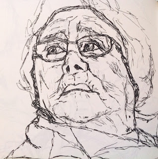
For my fragile narratives piece, I spent time in residential homes and with users of Age UK Day services in Cheltenham sketching people whilst they told me anecdotes from their past.

I really enjoyed this process, some of the stories, such as the lady who worked on the Enigma project in Bletchley park during the second world war, and the man who was an engineer who designed aeroplanes, were absolutely fascinating and unexpected.

Below are some of the sketches produced. 


Wednesday, 6 March 2013

Gemma Anderson


Portraits; Patients and Psychiatrists began in 2007 when the forensic psychiatrist Dr Tim McInerny saw my etchings at the Royal College of Art’s Great Exhibition. I had made a series of portraits referring to pseudo-scientific theories: comparative physiognomy, phrenology and the Doctrine of Signatures.


I was especially interested in working on portraits of psychiatric patients. My grandmother had spent a period in a psychiatric hospital in 2004. Deeply aware of how her identity was diminished by the language of medicine. I witnessed how medical vocabulary failed to express the history and story of the individual I loved and knew so well.


Tim and I decided to work together on a project creating psychiatric portraits for the 2008 arts exhibition An Experiment in Collaboration, held at Jerwood Space in London. The positive response to this encouraged us to apply for a Wellcome Trust Arts Award so we could develop the concept further.

The project began in earnest in August 2009. Before we started, Tim recruited willing psychiatrists who could identify patients enthusiastic to take part; doctor and patient needed to have a significant working relationship. Although we were based at Bethlem Royal Hospital in Beckenham, I also made drawings at individuals’ homes in Hammersmith, Hampstead and Homerton, at a boys’ school in Brentford and at other NHS units – Kentish Town Community Mental Health Centre and the Maudsley Hospital in Denmark Hill.


Such drawing from life requires trusting relationships with individuals and institutions, and it has been a wonderful experience of learning and discovery. Each individual led me on a search, as I wanted to draw not only the people but also the components in the portraits from life. Sometimes I used their personal possessions, but I found most of the animals, plants and other objects at the Royal College of Physicians, Kew Gardens and University College London’s Grant Museum of Zoology, Rock Room and Human Anatomy Room.


Through drawing, I have tried to represent the people involved in this project – their histories, medicines, interests and emotional worlds. The greatest privilege for me was being able to meet each person, hear their story, see their environment. Essential to this was learning about the perspective of both patient and psychiatrist, which was possible as I was granted permission to enter wards, sit in on meetings and ward rounds, and meet everyone involved first hand.


For more information about the project...

Monday, 4 March 2013

Hugh Turvey


Hugh Turvey

Trained as a designer / art director but on discovering photography he retrained under iconic photographer Gered Mankowitz. During 1996/1997 he started experimenting with x-ray/shadow photography after being asked to create an alternative ‘revealing’ image for an album cover. With the encouragement of the Science Photo Library he went on to produce an extensive series of coloured x-rays of everyday objects, which were first published on the 4 April 1999 in The Observer Magazine, LIFE, UK. In the same year Credit Suisse discovered Hughs x-ray vision and commissioned 6 ground breaking ‘motion x-ray’ European TV commercials


"The hands on approach and the manipulation of technique: overexposure, multiple exposure, chemical processing, filtering, rigs, mechanics, physics, happy accidents, trial and error and hand colouring.

I do not work exclusively with one set of x-ray equipment rather I tailor the equipment to requirement: for example to capture a small insect of low density is very different to that of capturing the high densities of a sports motorbike.

There is a technique to produce a photographic image without a camera by placing objects directly onto the surface of a photo-sensitive material such as photographic paper and then exposing it to light. These are called photograms (or as Man Ray called the "rayographs" ) and is one of the first photographic imaging techniques ever used by William Fox Talbot (and he called them “photogenic drawings”).

Simply put, the only difference between my x-ray images and the photograms produced by the early photographic pioneers is the frequency of the ‘light’ used to expose the ‘paper’. I have created (unlike the 'Roentgenogram' which is pertaining to the originators name) a more generic term ' XOGRAM ' to define my x-ray images within the context of my photographic background and the cross over of my visible light and x-ray images. 
 
I have also created the term ' XOGRAFIA ' to define the act of producing xograms"


.


Sunday, 3 March 2013

Fragile Narratives, 2011

As a doctor, I am interested in the important, but often overlooked, interface between art and medicine, as this provides a unique insight into the human condition.  I wanted to celebrate people’s narratives and histories, and experiment with different methods of recording and documenting these narratives. It is also interesting to see how some narratives become distorted by a disease process. I wanted to highlight how these narratives impact upon the next generation.


I did not want my work to be morbid, but instead something beautiful, celebrating life.


In our society, death and dying are seen as the last taboo. As a culture, our attitudes towards the elderly and the dying are not as positive as those held by other cultures. This is reflected in the recent political reports indicating that care in the fields of old age and palliative medicine needs to be done better. I have often witnessed people being defined solely by their disease, dehumanising them.

 
I decided to use fabric in this piece because of the narrative connotations associated with it... ‘spinning a yarn’/ ‘picking up a thread’/‘to fabricate’, etc. Also fabric has a certain delicacy and vulnerability that I wanted to take advantage of for this piece. 


 Fabric also has very personal and intimate associations with people throughout a lifetime, for example, fabric is the first thing we come into contact with when we are born, surrounds us throughout life in the form of clothing and bedding, and is the last thing to touch our skin in death.


I was really pleased with the transparency of the net curtains used to work on. I felt this represented the vulnerability of these people and how this group of people can be forgotten by society, hidden in their homes and looking out through their net curtains.